This is a logo for a website called lost types, I found it on google images. I think the reason they used this typeface because the way it written (bold, capitals) is the same way a street sign is written so if you're lost you can read the sigh which helps you find your way.

This is the for HMV. I think the reason the person designed it because the curves represent a disco ball so show it all about music or main stuff is music.

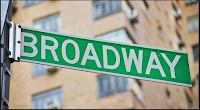
This is a street sign from New York. Having the wording in capital and all the same with straight line helps people to see spot the sign

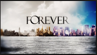
This is a title for tv show Forever. They used Serif showing its has an old fashion theme to it but also having the words close together for another reason it goes with the title forever.

 This is the Subway Title. I think the reason it's use the typeface its the same as a actual subway sign so since it being called subway they use the font and both ends they have used arrows pointing different ways.
This a title for a tv show Major Crimes. I think they used this font to To put it out their for people to see it and get people to watch it.
Motorway Sign. The design is written with SAN-SERIF because it helps keep the writing straight and even and it helps people to see it when driving along the motorway
Social Media Twitter. I think they used this design was because it's different from other social medias it curvy as simple.


