Showing posts with label Steve. Show all posts

Thursday, 4 February 2016

Toy poster Update on the name


I have decided to change the name to 'Build your own Funhouse' It makes it more of a boy/girl house whereas Dollhouse I think would catch more of the girls eyes then the boys.

This is the poster for the 'Build your own Funhouse' it show the doll house separate, plus with bright colour to show that it can be what ever the child want it to be. It so they can use their imagination as they build it.

This is showing that the house is not attach together like other doll houses but separate, so that it shows that you can build it together yourself.

The colours I added to the house is to show is that it can look like anything the child wants it to be so that making more a unisex house so that both girls and boys can build and use their imagination to design it however they want it to look like.

Poster 2

Tuesday, 2 February 2016

Toys

Build your own doll house.

It's not a fill the doll house up with furniture, but all the boarder unattached to each other so you've got to build it yourself. You can paint it how you want it to be, then glue it all together using the bits and bob that comes with it and the help from the instruction.

The whole doll house would be make from thin wood, so that it would be easy to attach together, but also if you decided to add something to the doll house you could buy more of the thin wood and use the other design from the instruction to go with the house.

I would say this is a unisex doll house because it's a build your own, paint any colour you want it kind of house, It's more for children to use their imagination, Like it could be  a girly house, it could be a superhero house, really anything they want without it being more of a girls toy then a boys.

Tuesday, 5 January 2016

Flash Popcorn


I still need to do the coding for the buttons to work so they'll go to the pages.

Monday, 4 January 2016

flash button and popcorn

In this lesson we used Adobe Flash to make a button and popcorn.


The first thing we did was the button which has 4 pages Up, Over, Down, Hit. In up is a blue circle. Over is the green button underneath. Down is the same as the green button but a light blue colour. Hit is a square where when you go over it it will change the blue button into the green picture then when you pressed on to the green button it will change into the light blue colour one.
The next one we did is the popcorn where we had to draw a popcorn corn the and a small explosion. Next was to add a sound to popcorn when you pressed onto the popcorn when it explosion. My was a thunder storm. The last one was to make the popcorn to move, This one I did have some trouble but having Steve explain it again it looked easy and showed me my mistake which was I used the button symbol when I should have used the movie symbol.  

Tuesday, 6 October 2015

What's on TV

I used the pages in What's on tv showing the different channels and the day the shows are on.

I've chosen Tuesday page.  They have all channels from BBC 1 to Channel 5 at the top and down the page it has all the shows and times plus on the left side of the page it has two pictures showing the pick of the day. The reason the used this type of layout is so people can see all the show on different channels and so they know what day. The size of the written morning shows are all small writing but bold whereas the afternoon show and all bold and bigger because more people are going to be watching the shows in the evening then the morning so they make it more bigger and give information on the show.


This page show's that the article is using a grid since theirs a picture in the middle of the text so what they've done is written around it to fit is all in plus they made the writing noticeable. They also added another picture in the corner relating to the article, For the title they have it in bold and all capitals and they've used both tracking and kerning so the title stays in the grid box but big enough to get peoples attention.


Type family


Monday, 5 October 2015

SERIF and SANS-SERIF

The differences between the SERIF and SANS-SERIF typeface is that serif has the small lines on top and the bottom of the word whereas the sans serif doesn’t have the small lines.

Slab-serif which is also known as Egyptian is a font that is thin but also grown bolder.

Uncial is the font that was used along time ago, You would mostly see them in book in museums or bibles or scroll. They were written by monks since they were the only people who could read or write.  

What is a grid

Grid is a template which is used to keep writing in certain place and areas. Grid are used in a few things like articles, tools, books, templates and blogs. 

Like with articles they use shote sentences on the pictures so the use a grid to make it fit on the picture and the article. A mag like What's on TV they use a grid for the days of the week and on top are all the names of day time soups and dramas in the morning with the main points on what happening in the episodes on that day.
For books their are different types of grid like in children's book and adults book. When writing a children book it needs to fit ever under the pictures or maybe around the picture. With adult books their are no picture so it has to be written downward in the same size and page size as the rest.

Grid are to help keep writing in certain places for different thing like articles and book to write on top or below the pictures.  

Parts of typeface


Wednesday, 30 September 2015

Different Types

Work today is to find 8 types that are different. I need to explain what it is and where I found it, Another is why the person who design the type use the typeface.
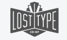


This is a logo for a website called lost types, I found it on google images. I think the reason they used this typeface because the way it written (bold, capitals) is the same way a street sign is written so if you're lost you can read the sigh which helps you find your way.


This is the for HMV. I think the reason the person designed it because the curves represent a disco ball so show it all about music or main stuff is music.
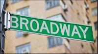


This is a street sign from New York. Having the wording in capital and all the same with straight line helps people to see spot the sign
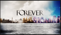


This is a title for tv show Forever. They used Serif showing its has an old fashion theme to it but also having the words close together for another reason it goes with the title forever.




This is the Subway Title. I think the reason it's use the typeface its the same as a actual subway sign so since it being called subway they use the font and both ends they have used arrows pointing different ways.


This a title for a tv show Major Crimes. I think they used this font to To put it out their for people to see it and get people to watch it.


Motorway Sign. The design is written with SAN-SERIF because it helps keep the writing straight and even and it helps people to see it when driving along the motorway

Website YouTube. The reason I think why the person used this typeface is because It something people will remember its simple and goes well.


Social Media Twitter. I think they used this design was because it's different from other social medias it curvy as simple.

Tuesday, 29 September 2015

Monday, 28 September 2015

Colour wheel


I used my iPhone to take picture of colour objects around town. Once I had enough pictures I came back to the classroom where I uploaded them on the computer. Once there all loaded on to the computer and bring up photoshop. Before i could crop the colour pictures and needed a colour wheel which I had to find on google then get that onto photoshop and save it. Once that was done I then add layer of different picture from town then crop the picture then add them onto the colour wheel to where they belong to.