In lesson we all had the same silent film about a man in a library who's trying to read but gets distracted by the sound made by the 3 people and a ticking clock. Once we've seen the short film Tobie sent us out in groups of 4 with a recording device and recorded sounds related to the sound that would be made in the library.
First location was the library where we just recorded the sound of the library which were people talking quietly and people using the computer, tapping on the keyboard.
The next location had to be somewhere quite just so we could make the sound without getting anything in the background. My group went to Hive B to recored but the other groups kept coming into the classroom so we only got one recording. We ended up moving to the performing arts room to recored all of our sounds.
After spending enough time down there to record all our sounds we went back to our classroom where we each downloaded the sound on to our computers and I downloaded the my sounds into a file then got Premiere Pro up, got the film and sound onto it then saved it and put it in the same file with the sounds we recored.
I started to measure and attach some of the sounds to part of the film that it should go to.
Today
I added more of the sounds to the film plus a background sound which was the recorded from the library.
I enjoy recorded the sound because it was fun trying to create a sound to sound like what we want it to sound.
I wouldn't say I haven completely enjoyed adding the sounds to the film, but it has be a bit hard trying to get the sounds at the right pace and right time as the people, who for say swallowing I found that bit hard to get at just the right time as the man/women swallowing.
The different between gain and volume is that gain is used on how loud the sounds on the film whereas the volume is how loud the person turns it up the film to make it louder.
The reason we need balance audio is important because if it's too loud then it won't sound right, so you need it at a certain level so that it'll sound clear and right.
Wednesday, 16 December 2015
Christmas cartoon
Sainsbury Mog advert
It's all real people except the cat which i think was a bit animated but might have be real in the shooting of the advert then changed into the animation to make it better, Plus the dream were good. I do think thought that its a bit unrealised mostly the whole neighbours coming over to the family's house and the cat starting the fire, I would say they went bit over the top but at the end it was a good christmas advert; But I didn't really get what it had to do with Sainsbury it didn't show the shop, their food/drink nor prices.
Walt Disney "Santa's Workshop"
The silly symphony "Santa Workshop" is an old cartoon so in it, it has scenes where it would repeat itself over and over again. It was all hand drawn and had colour along with it instead of it being in black and white which makes it better because it christmas so it very colourful since it being in a toy factory and Santa Claus big red suit. It also had singing which to me shows that its a old film because of the type of music. For it being made in the 1930's I would say that Walt Disney did a really good cartoon animation. Another thing was Santa Claus who only spoke at the beginning mostly laugh the same laugh so that was a repeat as well. Another thing is Santa's glove are like Micky Mouse's hands.
Silly Symphony Part 2 The night before christmas
This is kind of a part 2 to where santa is delivering the present to the house. I like how the objects sound and voices go well with the background music. Their was also toy of Micky Mouse which is what Walt Disney was famous for, Again it a nice, sweet little film and the music was really nice. The bit where all the toys started to to come along to the tree was nice and another was the candle when it was glowing you could tell it was and so was the tree. I also notices that all the children were all the same just different hair length and colour except for the small boy which I think was a bit different to the rest. Again in this one Santa didn't talk but laugh and play the trumpet and piano.
Santa Claus is coming
I really did not like that one it was was not christmasy and should not be shown to small children. It was horrible, it kind of made me sad and something I would never want to see again. It was done by flash, the colouring was dark and gloomy so made it more less like christmas the drawing of the character were good (even thought I didn't like it) I would say that the person who made this should put his talent to good use and make a happier christmas.
Christmas comes but once a year
This was a bit different from the disney film, the ending was what i think was different was the tree because it looked when the scene went darker. It was kind of the same as the silly symphony with al the children looking the same except for the last one that looked liked a baby. What was different from the silly symphony was the voices because their was more different talking and not all the same except the singing, man laughing and the crying they were was more voices. I guess it did look a bit different from the Silly Symphony because it was darker then Silly Symphony but it didn't repeat itself so much as the Silly Symphony did.
Tuesday, 15 December 2015
Christmas tree
Well for a start this even thought it had instructions I found difficult getting the pine needle exactly like the one from the web.
Thursday, 10 December 2015
My christmas card design result
This is the my final design of my christmas card and from what i think i think i did a good job for it being my first time but I would say i've not done a bad job at it. My one downer was the snow on the sea, wasn't how I imaged it to look like but it was the nears thing so if could have been done again, I would try and figure a way to get the snow looking more like snow.
Inside the message is Have a magically Christmas and an amazing new year'.
This card i would say would soemthing that females between 30-55 and men aged between 50-65. I think people who like the sea and maybe more of a nighttime person would like this more.
I would probley market my card from a tourist shop, because i think it would make a good card for someone who here on holiday and something they would pick up to keep maybe or you know to give to someone.
Candy
In this lesson we learn how to create this.
We started by getting a new page up using 100 pixels for both width and hight, Once that was up we dragged the ruler into the middle of the page. With that we used shapes to get a rectangle and drew it in the middle. Then instead of making two more we pressed alt button and moved them to each side; Once that was done I moved the side rectangle more at the side to give the gaps more space.
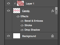
The next bit was we made a new page where we used the Text tool and wrote Candy in a white, pink, red colour. Next we used the paint bucket and changed it to pattern so when we pressed it onto the page all the stripes were on top of Candy; Next was the Create Clipper Mask which made the stripes disappear into the background and leaves the stripes on the candy along with the pink, white, red colour
Once that was done we went and used fx Tool on the right bottom bit where we used stroke which gave the outer word a bright colour line, Next was the Drop Shadow with gave us the green glow.
Lastly we used Bevel & Emboss which made the word bolder and comes out at you which makes it look better.
We started by getting a new page up using 100 pixels for both width and hight, Once that was up we dragged the ruler into the middle of the page. With that we used shapes to get a rectangle and drew it in the middle. Then instead of making two more we pressed alt button and moved them to each side; Once that was done I moved the side rectangle more at the side to give the gaps more space.

The next bit was we made a new page where we used the Text tool and wrote Candy in a white, pink, red colour. Next we used the paint bucket and changed it to pattern so when we pressed it onto the page all the stripes were on top of Candy; Next was the Create Clipper Mask which made the stripes disappear into the background and leaves the stripes on the candy along with the pink, white, red colour
Once that was done we went and used fx Tool on the right bottom bit where we used stroke which gave the outer word a bright colour line, Next was the Drop Shadow with gave us the green glow.
Lastly we used Bevel & Emboss which made the word bolder and comes out at you which makes it look better.
Thursday, 3 December 2015
Christmas card plan
Tuesday, 1 December 2015
Moving animation
This is the animation of a ball getting dropped then bounces. What I was drew circles coming down a bit at a time so it would look better when fall and bouncing. At the end we had to make the ball do something at the end my was meant to be blood squirting out but it looks more like maybe legs or ears. For a first try I would say i've done o, Just maybe
Guitarist interview
Interviewing Guitarist
Todays lesson we edited a interview video recorded from 5 shots. (Close up, Over shoulder, Wide shot, unusual shot and a interview shot). Now when that was happening I was ill so I wasn't really sure what we were doing but Tobie explained it to me and gave me a sheet with what each shot was. At the end I got my video edited and finish. I've now exported and is now download onto Youtube plus theres a link on Facebook. It was a bit tricky getting the sound the same as the video but I think I did good.
I enjoyed also watching the others video, some were quite funny and loud, some were very good.
I think for mine if I were to do it again I would have done it differently by having the interview sound playing whilst different shots of Tobie playing the guitar.
Heres a link to my video:
https://www.youtube.com/watch?v=TO08OROAxmA&feature=youtu.be
Monday, 30 November 2015
Employability
Todays lesson we started with a warm up on industrial media jobs and name the skill need for that job.
then watched a youtube clip from the apprentice when the female side are pitching a shampoo product and answer the question on the board
'Was it a success and why?
What was good and what was bad?
What you would have done differently?
What you would have done differently?
Kind of similar to the question we had to answer.
Next we talked in pairs about what pitching is; I use video pitching like when someone create a tv show the person needs a producer and a tv company ever broadcast or cable to air the show and its them who decides to keep the show or not bother.
We then went back to our presentation we started a while back about media jobs we would like, mine is writer and director (but mostly the writer job) Then on photoshop he needed to make an message map and used what you've written and put in on the bored (Just one of the jobs)
Thursday, 19 November 2015
Photoshop (snowflake paint brush)
This is the christmas card we made by following Leanna instruction. First thing we needed to learn on was how to get the snowflake paint brush onto photoshop. Then one that was done she showed us a picture that she made which is kind of similar to the one I made and by using that she went through 1 step at a time with us following what she does and the ending result is the picture she has which is what I've got only the tree is a bit different but other than that it turned out well.
I think I mostly like is the Merry Christmas, I might use that on my christmas card not completely sure but mostly 50/50.
What I'm enjoying and Fanfic
In class we started to create to a story idea involving an envelope and a mystery phone calling telling where to take the the envelope too.
I'm really enjoying this lesson because I really enjoy writing story and i'm really proud of the Fanfic I've written and put online for everyone to read. I think this took a lot to do this because you're letting people you don't know, read your story and for all you know might give you bad review but then again it always to have people you the good things about your, Help you keep to carry on and write more stories, definitely worked for me.
My FanFic
https://www.fanfiction.net/s/11202106/1/Family-and-Friends-reunion 1st story I wrote
https://www.fanfiction.net/s/11246031/1/The-Memorable-Week 2nd Story
Even thought I got more reviews on my second story, I'm more proud of my 1st one
Character Order on the picture
Andy Flynn (Guy on knee), Buzz Watson (holding the camera), Amy Sykes, Mike Tao, Sharon Raydor, Louis Provenza, Chief Taylor, Julio Sanchez and Dr Morales.
Christmas card ideas
For this board we had to use pinterest which is a website that full of people design for different themes like christmas, disney, sea, ECT... On there we all signed up for our own account then we needed to make our own board which is the 'Christmas card ideas' then find other pictures that related to our own ideas for our christmas card.
All the pictures at top all have something I want to use on my card, I've also decided to used materials like gold and silver glitter (silver-snow, gold-magic) and Iridescent scatter for the northern lights because of the way it changes colour when the lights hit it.
The card shape is is a tall rectangle. 40% of the lower card is going to be the sea and the rest of the 60% is the sky with a full bright moon in the middle.
Sky
Above the moon is where the Northern lights are gonna be and onto the lights i'm adding the Iridescent scatter, not too much that you can see the lights but enough so that it'll give it a bit of an effected; On top of the and the rest in sky is gonna have the small twinkle stars. The sky's is going to be at night because it to me makes it more christmasy.
Sea
In the sea there will be snow in the water, on the snow I'll be adding silver glitter to it to make it more christmasy.
Moon
In the moon there will be the shadow of Santa Claus in his sleigh along with his reindeers. Under his sleigh is the gold glitter representing magic, underneath written on the moon its going to say Christmas with Merry above the sleight on the moon.
Colour scheme
Dark blue, black. white, grey, sliver, gold
Monday, 16 November 2015
Blog Post answers (About Marijuana)
- What did you read that you didn’t know before?
That Marijuana can lower your grades and even make you drop out of high school.
- Does this blog post change your views? If so, how?
Well a little bit. I mean I would never takes drugs nor would I try it but it definitely show that it can change your grades because in TV show it shows people taking drugs to keep them up at night to help you study when in real life Marijuana help lower your grades.
- How might the information in this post be useful to you?
It mostly another good reason why young people should't take drugs, It effects your life and looks.
- What are some of the risks involved in doing drugs? Do you think about these risks? Why or why not? I think that it affecting you grades is a risk because it effecting your further; People want good paying jobs but if taking drug is causing you to get lower grades then you're most likely get a job you don't want but it'll pay the bill or no job at all if you leave school because of taking drugs.
- How does media play a role in drug use and addiction? Consider all types of media, including television and movies, social media, and advertisements.
Tv shows and social media do show the consequences are if you take drugs and what would mostly happen like the way you look, What would happen if you try to go cold turkey altogether but at the same time they do show way on how to get sober if you really want to. Media help a lot from what I've seen on Facebook there're post of people mugshots before and after from when they've been arrested again and overly been taking drugs.
At the same time though when they used drugs in a tv show showing students taking something to help studies this could be getting students to take them as well because it shows them what the drug is called and if nothing happens to them on tv they might think it'll be alright for them to take in real life.
At the same time though when they used drugs in a tv show showing students taking something to help studies this could be getting students to take them as well because it shows them what the drug is called and if nothing happens to them on tv they might think it'll be alright for them to take in real life.
Thursday, 5 November 2015
Location Scout and Recce
Location Scout- Is when looking for a location for a film/tv show that just had it scripted finished and now the scene need a outside location.
Recce- Is re visiting a site/location to work on like shooting a film/tv show
They are important because without the people who's job it is to find the location they wouldn't be able to find locations in time plus trying to permission to use the location and how long they can use it for.
The reason we have risk assessment is because when their on location they need to note down all the risk their because then they can warn the actors and crew on where the risks are and how not to get injured or if there's members of the public is their they can also make sure they don't injure anyone else .
animation waterfall
In class we had to make an animation and for my animation I did a water fall around my hat. How I did it was first getting a blue felt tip pen and 2 pieces of paper. Then I had to tear the paper getting long strips then ripping it up into smaller pieces.
Once that was done and coloured I got the photo booth up where I took a picture of me and just my hat without anything on it then I would add paper along the side my hat then take a picture and I would keep doing this until both side got close to each other that then I could swap it with another blue paper that I made that it would go around my hat plus it made it easier to attach the water fall on to it.
Once everything had a picture ad got photoshop up along with the guide that Steve put on Facebook. I used the guide to help figure out how to make the animation.
After a lot of frustrating attempts I finally made my animation. I would say for my first time making an animation I would say I did a good job, It could have been better but I'm happy with it.
Thursday, 22 October 2015
Infographic
This is my Infographic for behaviour in the classroom. It was meant to be the date from the quiz we took last week but this week I was ill so i didn't get the data so I made it up.
Investigating Type and Layout
This news peace is more for the younger generation because for one it's on the internet
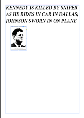
This is a heading form 'The New York Time' of JFK Assassination from 1963. This more for the older generation because the writing
Wednesday, 21 October 2015
Different type of shots in moving images
For The Bench group we have different shot's from different angles and highs. The reason there are different angles because instead of just seeing a scene just in the centre we can see them from different angels like a sky view or low view, A close up to a talking character or side angels focusing on the further person or which angels to see the other person. It make a film better seeing it from so many angels instead off focusing on just one view.
180 degree Rule
The 180 degree rule is used when recording a scene. It's to show two people from a centre view and 2 side views.
From the side view you are only focusing on the person further away from you, Its the same for both sides.
The 180 degree rule is when you recorded two people ever standing or sitting facing each other or just next to them. where their ever standing or sitting there is a line across them, If you record on one side of that line you can't go over the line otherwise you will break the 180 degree rule.
When using this rule you can not break it because if you do it will end up looking odd. Recording from the centre is always ok but from the sides you've got to do it right.
Two people standing in front of each other, recoding the centre on the left side of the two people. Now that you have chosen your side you need to stay on that side when recoding the side shots. If you go on the other side and recorded the side shot it going to look like their standing in the wrong places from where they were from the centre shots.
short film with different video angels
In this short film that our group filmed, we used 3 different shot angles using the 180 degree rule.
We use a centre close up, So we only got both of their head and half of their upper body. The reason we did this is to we could see which side they are sitting and it look better because there're only sat down so it looks better just getting a close up on just their faces.
We then did a right side shot mostly focusing on Aaron. We did this because when I edited the video it helps shows that from the centre to the side filming it shows that he's sitting in the same place and it focus on him.
With the left side it's mostly the same it show that their sitting on the right side just like the first clip and that we're focusing on the person further on the other side of the Aaron.
The Short film.
https://www.youtube.com/watch?v=PVyrAKHbtqs
Thursday, 15 October 2015
reflective blog post of postcard and production processes
Bath Abbey Postcard
Looking back at making the postcard I think when looking up different postcards I think next time maybe go with something a bit more colourful or brighter. But I do like the postcard I did chose.
I chose a old postcard from Salem of the witch house, Which I tried to use as the idea for my postcard. New Orlean base on the Mardi Gras which again looked old but had more colour on it and the another postcard from Salem more like a painting of a church with the path way.
Finding the right background for the postcard was easy, Adding the colours to the photo was difficult. Since I'm so used to photoshop I did have some trouble with it but at the end I finally go the colours on. I did use the same colour from the which house for the church. The sky I did try to use the colour from the salem postcard but ended up just using brown and silver (Brown the sky, Silver the clouds) But it never looked right but I just left it but it did look ok. At the end it wasn't quite how I image it to be, Not what I had vision, But for a first time it was good.
What I would do differently?
Differently I would like to have redone the sky and find a way to be able to keep the sky how it is but just to be able to change it to the same colours as the sky in the The old witch house, Salem postcard.
Does it appeal to your choose audiences?
I think it does appeal to my chosen audiences because I tried to make it an older design and I think older people would like this especially if their also religious they'll like the Bath Abbey in the background.
Secondary Research & Why both Primary and Secondary are effective/importance
Both Primary and Secondary are used to get information but in different ways.
Primary Research is when people use surveys interview, questionaries or even group to get information from different people in interview or group gathering whereas Secondary Research they use the internet or magazines to find out information.
With Primary research asking people in interview about media is effective because you are asking an actual person not just using a computer to get information from, Another great way is in groups because that way you get more opinion and different answers. The importance of this is that this way you get people honest option and it looks better when people know that a company has asked people in person.
Secondary Research is also an effective because it uses the internet and magazines which has lots of information. With magazines you get peoples opinion depending on what the magazine is. Using the internet is also effectiveness because you can get information about places or objects fast and definitely get a lot of history. Also it helps keep you up to date with new information.
I found that Secondary is better then primary because in class we got to make a survey about postcard which we put on Facebook for our friends to take part and to share with their friends. For my survey I got 11 responses from my survey which isn't a lot because of the small amount of people it got to.
These are 3 of the websites I found when doing the secondary research
http://www.localhistories.org/bath.html
Local histories: Roman Bath. Was founded in 860 BC by Prince Bladud who later on became king and founded City of Bath after finding a way to cure for his Leprosy.
Visit Bath: Bath Abbey. It began in 1499 where before it was known as 2 other names, An-Anglo-Saxon Abbey church from 757, a Norman cathedral around 1090 and the Bath Abbey which is present.
Wikipedia: Pulteney bridge: It was built in the 18th century when Bath became fashionable, Around that time The Royal Crescent and The Circus were also built.
Primary Research
Page 1 of 1
Survey for cardWhat buildings in bath would you like on a postcard?
Survey for Bath postcardWhat Sky setting would you like the photo being taken?
Survey for Bath postcardWhat occasion would you want the postcard set on?
Survey for Bath postcardIf you don't live here how many times do you come here?
Survey for Bath postcardWhat colour scheme do you prefer?
Survey for Bath postcardHo who do you keep in contact with family and friends
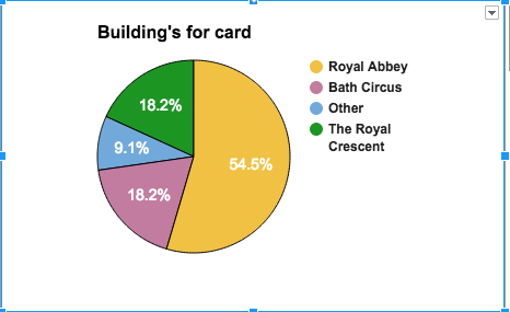

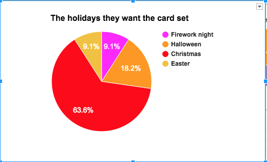
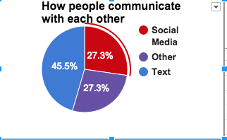

 These are the pie charts of the results I got from my 11 responses. Once it was on google sheets I made each category into a pie charts showing the most that people chosen. I was surprise that most people would like the setting on a postcard at sunset then mid day, So maybe next time I'll have the postcard set with a sunset sky gives it a bit of a change from the blue sky.
This is the survey I made using google form. This was made so we can get others people on Facebook to go through my survey and click on what they prefer on a postcard.
Audience profile
Audience profile for my postcard.
My Target audience are aged between 25-64 more for the young females 25-34 and older men and women 50-64. This postcard is demographic to the older population then the younger population. more at the older because with the pink writing and some of the pictures like the bike, college and the bird it might be more appealing to the young female then the young males. Another reason why I think this postcard would tracked more of the older men and women is because of the bird and the bikes, It seems like something they would be interested with.
I think if they're interested in birds or bike riding they would find this postcard more to their style. For the younger female I think if they're interested in bath college or of the nature person they would be more their kind of postcard.
How will you appeal in this audience?
The theme is more nature with the bird, tree and with the bike and map it gives the postcard more colour to it. So it's colourful but not over the top with nature on it.
Where will you market the postcard? Where would you like it to be on sale?
Maybe it would be better to have it on a website like a postcard website since more people are doing it more on the internet then buying them in shops. But if there’s no internet and with some older people they might like to buy them to college so I would have my in a tourist shop. Tuesday, 13 October 2015
Filming on location
Today we went to green park to record at a location which gave us an idea on what it's going to be like when recording outside. We got split into 2 groups then go of to record a scene.
When recording at a location you need to think where you're going to record and what are the errors; Like for us we recoded a scene on a bench in the sun with a coffee cup and a water bottle, Now the lighting was good the only problem was our shadows kept getting in the way depending on what angle we were recording on.
Next were noises; For us we had a road in the background but lucky they were hardly any cars driving back and forth so they shouldn't be much nosies in the shots.
Next is scenes; When you're making a film you need to think of what other scene can you film here. When recording you don't do the scenes in order you can do different one at the location; For us we only did the scenes on the bench.
The weather; The weather today was windy and sunny, So when recorded you need too make sure you have the same lighting and none of the props fall over by the wind.
Ed's lesson Scripts
We were looking at scrips. We went online to find scripts from films that we watch so we could use to react our seen. I choose The Conjuring scene where Ed and Lorraine Warren are with the nurse about the Annabelle. Truthfully I think that scene would have been easy to do but we ended up doing aa scene form Rush hour because it was the only film we all knew.
Once we found a room we got everything together and got the camera up. I was helping with getting the camera up whist Aaron and Ben rehearse their lines.
At the end Aaron and Ben were having trouble remembering there line so they ended up making up there own word which made the scene very fun. Once we got all the shots we went back into the hive to download the scenes and edit. Once all edited we download them on youtube.
Filming Rush Hour react
We got put in groups of 4 and for my group we did a scene from rush hour. Once we found a place to record then do the 3 shots we went back to the hive where we download the recorded shot then edited it.
My was ok, Would have been better if I added music to the background.
Link to my video
https://www.youtube.com/watch?v=PVyrAKHbtqs
My was ok, Would have been better if I added music to the background.
Link to my video
https://www.youtube.com/watch?v=PVyrAKHbtqs
Thursday, 8 October 2015
Bath postcard desigh
How created
First we had to go in group so we could go into town and each take a photo around bath on the camera.
One we had our pictures we went on photoshop and create a new project, Mines called postcard 4 because it took me 4 attempts to make the card. On the left is the layer box where you can see where all the the pictures and the text are. If you press on one of the layer you can only edit and do whatever you want on that picture. Once all the pictures are in their places I then added the text 'City of Bath' in the middle, I then changed the colour of the text since half of city disappear because of the white sky into a dark red colour then saved and it was complete.
One thing you like and why
The one thing I like about my postcard is the picture at the bottom right because of the way it's angled, the composition of the picture. Then you can see the bike shadow and the people sitting on the bench, It just looks nice and it shows that Bath has Bike rides.
One thing you don't like and why
I'm not so keen on the bottom left picture because you don't get the whole of the tree so which I think would have made it look better. Also if it was the whole tree it would look better with the top bit cut down to the tree is it was a whole tree.
One thing you like and why
The one thing I like is the the top pictures because I like the way it's been taken, The way the christmas light is big and that its got some light and the sky in it. With the church its nice that it has a blue sky with some cloud above it with some of the Roman Bath build long on the side of the picture and that they both got something to do with a bit of Christmas.
One thing you don't like and why
I don't like the bottom right picture, What I should have done was zoom into the Christmas light. With the postcard the two corners the lights are on is meant to be the main thing but as you can see theres only one noticeable light and the other is to small and you can't really see it
One thing you like and why
I like that one side of the card is all bright and light and the other side is dark. It's like showing that Bath have both light and dark sides.
One thing you don't like and why
I don't like the the bottom right picture. it looks different from before I took the picture, Next time I would brighten it up a bit or just clean the window a bit.
Tuesday, 6 October 2015
Bath postcard
What I've done is that I used both the black and white postcard and the painting on a postcard. The sky colour is from the colour and the grey is meant to be the cloud even thou it doesn't look like the clouds anymore thats what it meant to look like. For the Abbey I used the painting idea and made it look more painted by where the shadow parts are I used a darker colour from the black and white postcard and left the light colours alone.
What's on TV
I used the pages in What's on tv showing the different channels and the day the shows are on.
I've chosen Tuesday page. They have all channels from BBC 1 to Channel 5 at the top and down the page it has all the shows and times plus on the left side of the page it has two pictures showing the pick of the day. The reason the used this type of layout is so people can see all the show on different channels and so they know what day. The size of the written morning shows are all small writing but bold whereas the afternoon show and all bold and bigger because more people are going to be watching the shows in the evening then the morning so they make it more bigger and give information on the show.
This page show's that the article is using a grid since theirs a picture in the middle of the text so what they've done is written around it to fit is all in plus they made the writing noticeable. They also added another picture in the corner relating to the article, For the title they have it in bold and all capitals and they've used both tracking and kerning so the title stays in the grid box but big enough to get peoples attention.
Monday, 5 October 2015
Typeface and Fonts
The differences between Typeface and fonts is that font changes the way the word is written the style of the word like making the word fancy, bold, thin..., Whereas typeface changes the design of the worlds like using shapes, balance or instead of writing you use objects to spell out the words.
SERIF and SANS-SERIF
The differences between the SERIF and SANS-SERIF typeface is that serif has the small lines on top and the bottom of the word whereas the sans serif doesn’t have the small lines.
Slab-serif which is also known as Egyptian is a font that is thin but also grown bolder.
Uncial is the font that was used along time ago, You would mostly see them in book in museums or bibles or scroll. They were written by monks since they were the only people who could read or write.
Slab-serif which is also known as Egyptian is a font that is thin but also grown bolder.
Uncial is the font that was used along time ago, You would mostly see them in book in museums or bibles or scroll. They were written by monks since they were the only people who could read or write.
What is a grid
Grid is a template which is used to keep writing in certain place and areas. Grid are used in a few things like articles, tools, books, templates and blogs.
Like with articles they use shote sentences on the pictures so the use a grid to make it fit on the picture and the article. A mag like What's on TV they use a grid for the days of the week and on top are all the names of day time soups and dramas in the morning with the main points on what happening in the episodes on that day.
For books their are different types of grid like in children's book and adults book. When writing a children book it needs to fit ever under the pictures or maybe around the picture. With adult books their are no picture so it has to be written downward in the same size and page size as the rest.
Grid are to help keep writing in certain places for different thing like articles and book to write on top or below the pictures.
recap on postcard
Last week we had to look up different audience on what kind of postcard they would get like...
Age
Religion
gender
Then we had to design our own postcard and think about who our audience are. We went on the internet and looked at different type of postcards, Me I looked up postcards from New Orleans and Salem and there I found the black and white postcard of the which house and the painting and the people dress in colours for the Mardi Gras all different styles. Then I found a picture of the side of Bath Abbey which I will use for my postcard.
Sunday, 4 October 2015
Kerning and Tracking
Kerning is what helps keeps a cap between the letters. Tracking is used to keep letters together or if you want to make the words bigger the tracker loosen so that the letter separate evenly.
Wednesday, 30 September 2015
Different Types
Work today is to find 8 types that are different. I need to explain what it is and where I found it, Another is why the person who design the type use the typeface.

This is a logo for a website called lost types, I found it on google images. I think the reason they used this typeface because the way it written (bold, capitals) is the same way a street sign is written so if you're lost you can read the sigh which helps you find your way.
This is the for HMV. I think the reason the person designed it because the curves represent a disco ball so show it all about music or main stuff is music.
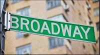
This is a street sign from New York. Having the wording in capital and all the same with straight line helps people to see spot the sign
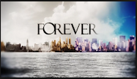
This is a title for tv show Forever. They used Serif showing its has an old fashion theme to it but also having the words close together for another reason it goes with the title forever.

 This is the Subway Title. I think the reason it's use the typeface its the same as a actual subway sign so since it being called subway they use the font and both ends they have used arrows pointing different ways.
This a title for a tv show Major Crimes. I think they used this font to To put it out their for people to see it and get people to watch it.
Motorway Sign. The design is written with SAN-SERIF because it helps keep the writing straight and even and it helps people to see it when driving along the motorway
 Website YouTube. The reason I think why the person used this typeface is because It something people will remember its simple and goes well.
Social Media Twitter. I think they used this design was because it's different from other social medias it curvy as simple.

This is a logo for a website called lost types, I found it on google images. I think the reason they used this typeface because the way it written (bold, capitals) is the same way a street sign is written so if you're lost you can read the sigh which helps you find your way.

This is the for HMV. I think the reason the person designed it because the curves represent a disco ball so show it all about music or main stuff is music.

This is a street sign from New York. Having the wording in capital and all the same with straight line helps people to see spot the sign

This is a title for tv show Forever. They used Serif showing its has an old fashion theme to it but also having the words close together for another reason it goes with the title forever.

 This is the Subway Title. I think the reason it's use the typeface its the same as a actual subway sign so since it being called subway they use the font and both ends they have used arrows pointing different ways.
This a title for a tv show Major Crimes. I think they used this font to To put it out their for people to see it and get people to watch it.
Motorway Sign. The design is written with SAN-SERIF because it helps keep the writing straight and even and it helps people to see it when driving along the motorway
Social Media Twitter. I think they used this design was because it's different from other social medias it curvy as simple.
Subscribe to:
Comments (Atom)


